Performing Analysis Of Meteorological Data
This article serves as a documentation of my first project — Performing Analysis of Meteorological Data for my internship program at Suven Consultants & Technology Pvt. Ltd.
The main objective of this Data Analytics Internship is to transform the raw data into information and then convert it into knowledge. Since weather data is one of the most easily available data on the internet, it serves as a great starting point to understand fundamental data analytics concepts.
Dataset
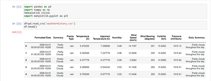
The dataset has hourly temperature recorded for last 10 years starting from 2006–04–01 00:00:00.000 +0200 to 2016–09–09 23:00:00.000 +0200. It corresponds to Finland, a country in the Northern Europe.
Download the weather dataset from this Google drive link.
Goal
Transform the raw data into information and then convert it into knowledge. By -
- Perform data cleaning,
- Perform analysis for testing the given Null Hypothesis (H0) &
- Write a descriptive blog with relevant visualizations to prove your point.
Null Hypothesis (H0)
“Has the apparent temperature & humidity compared monthly across 10 years of the data, indicate an increase due to Global warming.”
The H0 means we need to find whether the average Apparent temperature for the month of a month say April starting from 2006 to 2016 and the average humidity for the same period have increased or not. This monthly analysis has to be done for all 12 months over the 10 year period. So you are basically resampling your data from hourly to monthly, then comparing the same month over the 10 year period. Support your analysis by appropriate visualizations using matplotlib and / or seaborn library.
Implementation -
Step 1: Importing the Necessary Libraries & Data

Step 2: Data cleaning
2.1 Find all Missing values from the Dataset.

2.2 In this step we will prepare our data for the plotting , we will first drop the unwanted columns (all except temperature and humidity) .

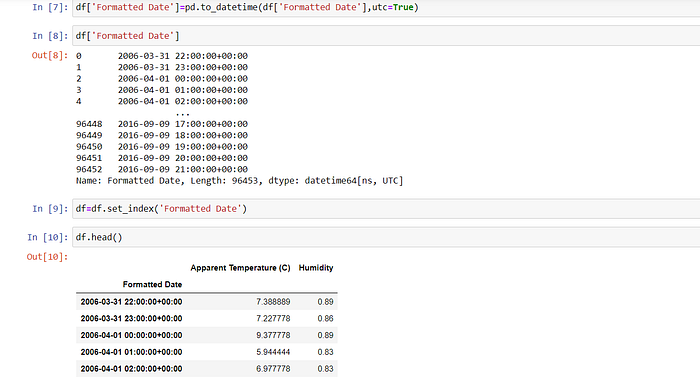
2.3 Change the format of data for better analysis
Converted the ‘Formatted Date’ column to standard Python datetime format for easier analysis.
Then ,we will convert the Timezone to +00:00 UTC .

Step 3: Resample data from hourly to month wise
The data in the dataset is hourly values, we resample the entire dataset to monthly values to meet our analysis requirements.

Step 4: Analysis plots of temperature & humidity over the range of years in the dataset
4.1 Variation in apparent temperature & humidity with time (in years)

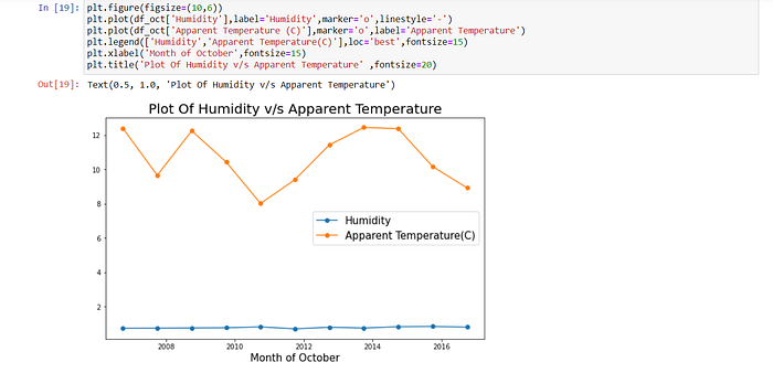
Now we will plot graph for a specific month(October).


Conclusion -
- No change in average humidity observable.
- Thus we can see decrease in Apparent Temperature in the year 2008 and slight increase in 2009 and then dropping severly in 2010 and 2011 with a slight increase in 2012 further we see significant increase till 2015 and again its starts dropping from 2016 onwards.
- Global warming is no doubt deteriorating the climate and is affecting various parameters of the environment. Hence from this analysis we infer that there are either sharp rise in temperatures or sharp falls over the 10 yrs.
- According to Null Hypothesis (H0) both increases due to Global Warming is proven wrong here, and thus null hypothesis failed.
- “I am thankful to mentors at https://internship.suvenconsultants.com for providing awesome problem statements and giving many of us a Coding Internship Experience. Thank you www.suvenconsultants.com".
